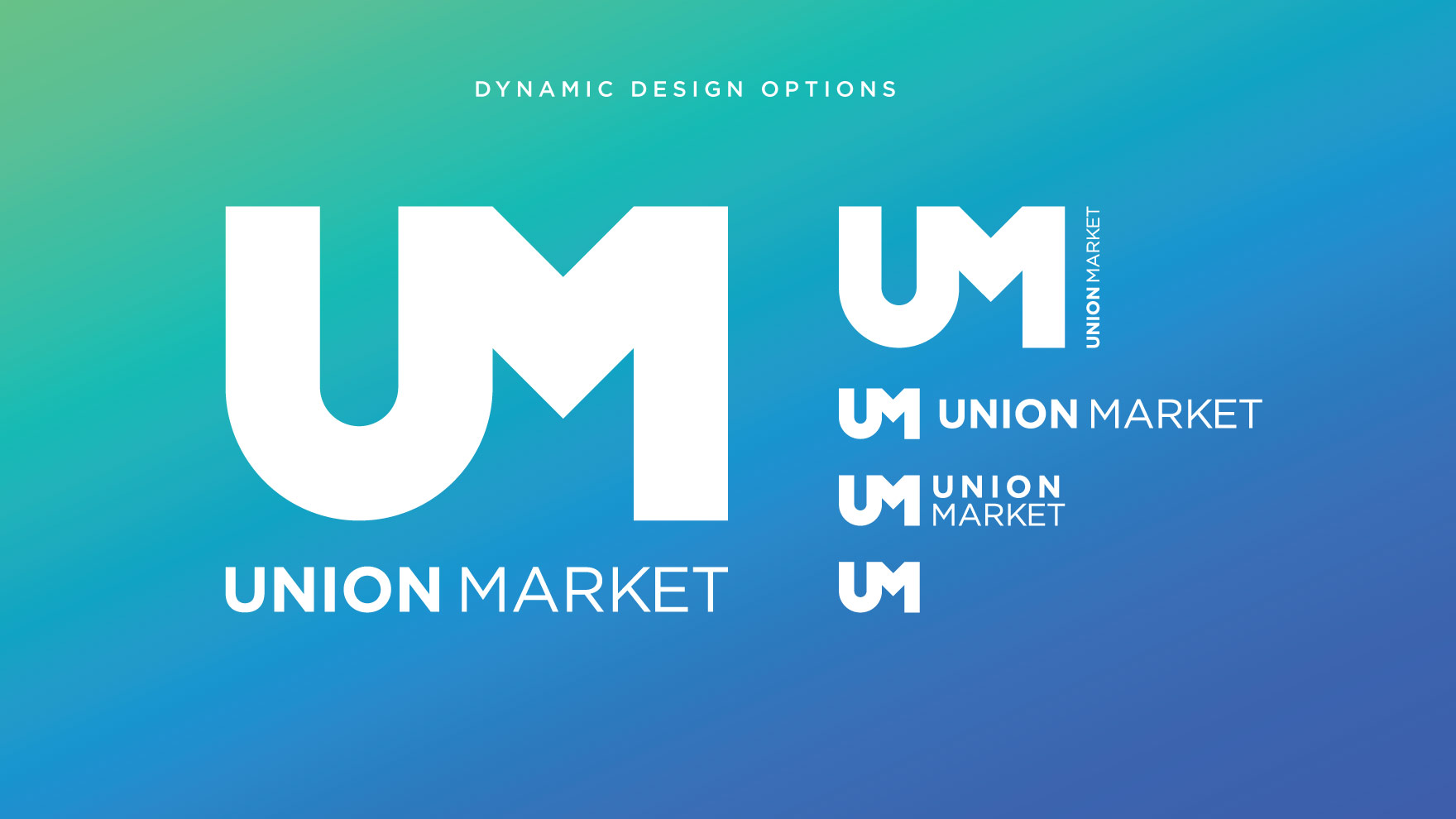
Union Market's community of local entrepreneurs and artisans needed a brand identity that captured their spirit and conveyed their values. They also required a versatile logo that could be applied seamlessly across all platforms without disrupting the existing brand. The solution was a multi-functional logo system that could be adapted to different applications, allowing Union Market to communicate beyond their own name. The result was a fluid brand identity that celebrated the unique character of the community and conveyed their message effectively.
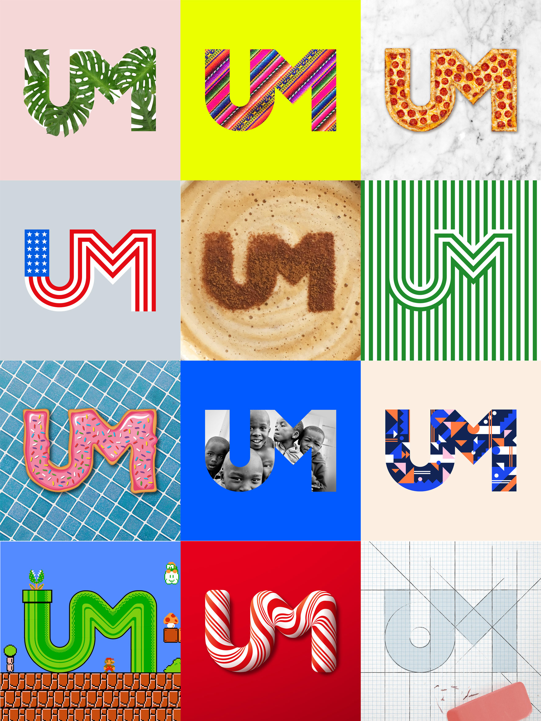
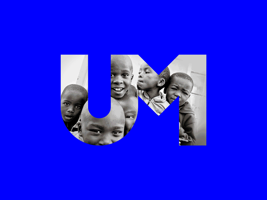
To maintain Union Market's existing brand recognition while enhancing its branding power, I proposed adding a new element to its word-mark: the "UM" ligature. This design amendment created a strong visual symbol that could be used in various applications, reinforcing the brand's identity while allowing for greater flexibility in messaging.